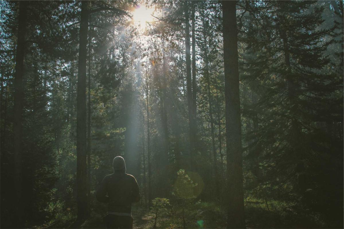
Feature Film — "Northern Lights"
HEEx
<div class="flex h-64 w-xs">
  <ConnieUI.Cards.background_image image={@project.image} click={JS.push("open")}>
    <ConnieUI.Typography.heading level="h3" class="text-white">
      {@project.name}
    </ConnieUI.Typography.heading>
  </ConnieUI.Cards.background_image>
</div>
Variant matrix
Every combination of one or two attributes, side by side.
Controls
Set by the example
gradient click
Docs
A card's picture with its content laid over the bottom, or a fallback in its
place: grey, or `gradient` when `colored`.
On a light `colored` fallback (`ConnieUI.ColorTags.light?/1`) the card drops
the dark shade behind the content, sets `text-primary` and carries
`data-light`, so content that sets its own white text switches with a
`[[data-light]_&]:` variant, e.g. `text-white [[data-light]_&]:text-primary`.
| Attribute | Type | Default | Description |
|---|---|---|---|
| No data found. | |||
| image * | :string |
|
|
| fallback | :string | "No image" |
|
| colored | :boolean | false |
draws the fallback for a missing image in `gradient` rather than grey
|
| gradient | :any | nil |
a `ConnieUI.ColorTags` tag for a `colored` fallback; nil is the brand gradient
|
| grayscale | :boolean | false |
|
| click | {:struct, Phoenix.LiveView.JS} | nil |
|
| Slot | Slot attributes | Description |
|---|---|---|
| No data found. | ||
| inner_block * | ||